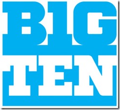
…not sure if I do or not. Here’s an example:
Here’s a link to the official announcement and a gallery of the new Big Ten logos.
Compare it to an example of the old one (it’s actually still up on the Big Ten web pages):
The older one had gradient effects and sort of a “raised” feel to it. The new one? Kinda flat. I know, it’s just a logo. But we’ll have to see it for the foreseeable future (probably until the Big Ten decides to expand again).
Thoughts?
Update: Looks like I’m not the only one who doesn’t care so much for it. “Unsightly”, says Time.


I hate it. I don’t like the color (North Carolina powder blue?) or the cheesy 70’s font. Ugh!
yeah, Tarheel blue… that’s what it reminds me of. or a baby boy’s nursery wall.